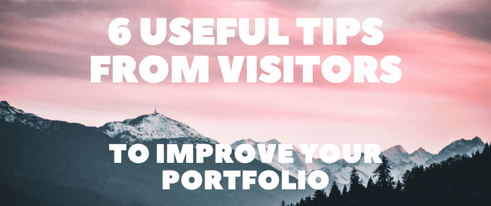
6 Useful Tips from Visitors To Improve your Portfolio
🕒 5 min read 🙎♂️ by Madza
Some months ago I posted an article about how I built my first personal portfolio. The feedback was pretty awesome and I got some great ideas on how I could improve it.
Thanks to users dyllandry, cdthomp1, sufyaan323, and zzoukk for leaving feedback and recommending most of these changes.
Lately, I decided to create a new branch on Git and start to work on them. Since the initial version was still deployed, it gave me an opportunity to compare both versions.
Hopefully, these revisions with before and after images will spark some ideas on how you can improve your portfolio as well.
1. Scrollable main feed
❌Before
First, my initial portfolio had a fully static landing page.
The only way users could access content was to click on the navigation items on the top right, otherwise, they would be left with an impression that the site is empty since there was no scroll.

💡 Feedback - by Dylan Landry
Looks clean. Biggest critique I have is that I think you should make your projects more easily visible. It was jaring to get to your home page, try scrolling to see more, have it not work, then have to search the UI for where I could see your work. Maybe just put that page of projects additionally at the bottom of your main page. Also I'd suggest adding more visual distinction between your projects. The only difference is their text, which requires reading each one to distingush them. Maybe add a bit of a picture to each one, either a picture of the project or some releated image off of unsplash. Looks good!
✅ After
During the revision, I made the landing area scrollable, and now it allows me to highlight the work that I want to present the most.
The main purpose of the portfolio was to showcase the projects that I've done, thus I decided to showcase both images and the features for 3 projects. Plus there are also 6 highlighted articles.

🔗 LIVE example
Plus I also configured my CMS (Contentful) to enable or disable any project or article as a highlight by just a tick of a box.

2. Visual Blog cards
❌Before
The blog cards of the first version consisted of just the title and description with no visual representation of the article.
Obviously, this did not help to entertain the reader and keep the visitors' attention. See the initial version below:

💡 Feedback - by Cameron Thompson
Your site looks great! I like the clean look and easy to use interface. It might be helpful to have thumbnail images on your project/article cards, to help visualize what the project/article might be about. Great work!
✅ After
During the revision, I focused on the image cover, so that it does not break the existing card layout, looks good on the dark background, and is responsive for mobile devices.

🔗 LIVE example
3. Animated Project cards
❌Before
Similarly, as the blog cards, project cards did not include any visuals either.
This was especially bad for projects, as no one really wanted to click through each and every project just to see what it looks like.

💡 Feedback - by Cameron Thompson
Your site looks great! I like the clean look and easy to use interface. It might be helpful to have thumbnail images on your project/article cards, to help visualize what the project/article might be about. Great work!
✅ After
So, I decided to include an image for each project.
I extended it even more by creating GIF images that could prescribe not only the design but the main functionality as well.

🔗 LIVE example
4. Separate Contact form
❌Before
The contact functionality on the initial version depended on how well the users had set up their systems. I used a mailto in href attribute, which could often end up with pop-ups asking to configure the email client.
✅ After
During the revision I created an independent route for contact functionality. I used react-hook-form for forms and Sendgrid for actual email service.

🔗 LIVE example
5. Custom 404 page
❌Before
My initial blog used stock NextJS 404 page.
Technically the users were informed about non-existing routes, tho they looked too basic and did not match the main theme of the portfolio.

✅ After
I took some nice SVG from Undraw.co, created a custom style for the page, created a custom warning information, and added a Home button so that users can be redirected to Home.

🔗 LIVE example
6. Other minor changes
💡 Feedback - by ShadowNinja
As a homework, I think you should try changing the y-axis scroll bar colour in the blog page into one that meets the theme of your website.
💡 Feedback - by zZouKk
This is cool! Psss... Live demo links are missing on project pages.
During the revision, I also fixed scrollbar styling, adjusted code highlighting, added access buttons to source and GitHub in projects, adjusted responsiveness for mobile devices, etc.
I've merged the revision branch into the master and it's deployed, so you can check the whole portfolio live at madza.dev. I will be thankful if have any comments or further feedback.
My main tip from this article would be to recommend using all the feedback you receive. Together we are building better products. And I believe we all learn by sharing knowledge.
Writing has always been my passion and it gives me pleasure to help and inspire people. If you have any questions, feel free to reach out!